Challenge How do we make a traditionally cumbersome process into an elegant and even fun experience for game developers?
Solution Direct discussions and user testing reveal pain points game developers encounter. Focus design towards alleviating those pain points.
Results A tailored experience tackling the usual pain points and turning them into a clear, step-by-step flow for game developers to guide them through a complicated process.
Kartridge, Kongregate’s desktop games application, had two main types of users: the players who purchase and play games on the platform, and the game developers that upload their content to sell and distribute on Kartridge.
It was the common feedback from early discussions with game developers that onboarding games on other platforms was far too complicated and confusing. It became important for us to relieve this pain point so that it would break down one huge barrier for developers to put their game on Kartridge, when their games have already been distributed across many other places.
Ease-of-use without sacrificing the necessary features and complexity, was our top priority for design. After research, through focus groups, 1:1 interviews, and surveys with developers, we came up with primary goals that should be solved through design:
- Usability: It should be clear to the developer, all throughout the game onboard process, what steps are necessary to publish their game.
- Easability: It should take the hassle and anxiety out of the game onboarding process.
- Creativity: It should be easy for developers to create a beautiful looking game storefront page without being a designer.
I started thinking through similar user experiences that hit the same notes and pain points that developers encounter while setting up their game - a meticulous and tedious process that needed scrutiny before submission - and was inspired by how current tax software utilized a checklist to set a flow to the user experience. It’s clear what you have and have not completed, and you can always go back and edit/complete items out of order.
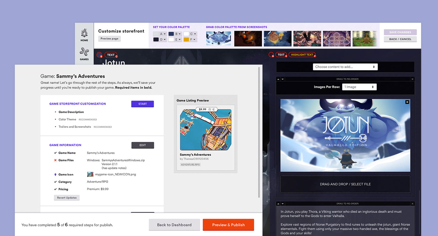
The end result was an easy-to-read checklist grouped by sections, where you can start or edit each item at your pace. Visual indicators, like big “Start” buttons, progress bars, and putting entered information front and center let developers know what they’ve completed in the process. A fixed bar at the bottom displayed an overview of complete steps as well.
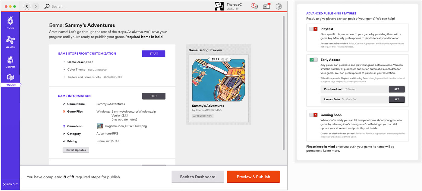 We listed out all the requirements, including content you have filled out, in a dashboard view so that developers were always aware what steps they've completed and what steps they need to take in order to be ready to publish their game.
We kept all setting options available to the developers, but wanted to be smart about only showing options relevant to their needs. For example, more advanced in-app purchase (IAP) options won’t be available initially unless the developer has indicated that they would like to integrate IAP in their games.
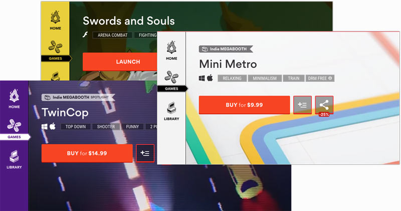
Before submitting their game and putting it live in the store, developers can do final checks on the information they’ve entered, test API integrations, and preview their storefront page to know and understand how their page will look to live users once the game is published.
Another major component of setting up the game is customizing the look and content of the game’s storefront page. As we looked at how developers were going through this process on other platforms, we found that they all use a generic form to gather content, which created a lot of back and forth between the content being set up and how it looked on the page.
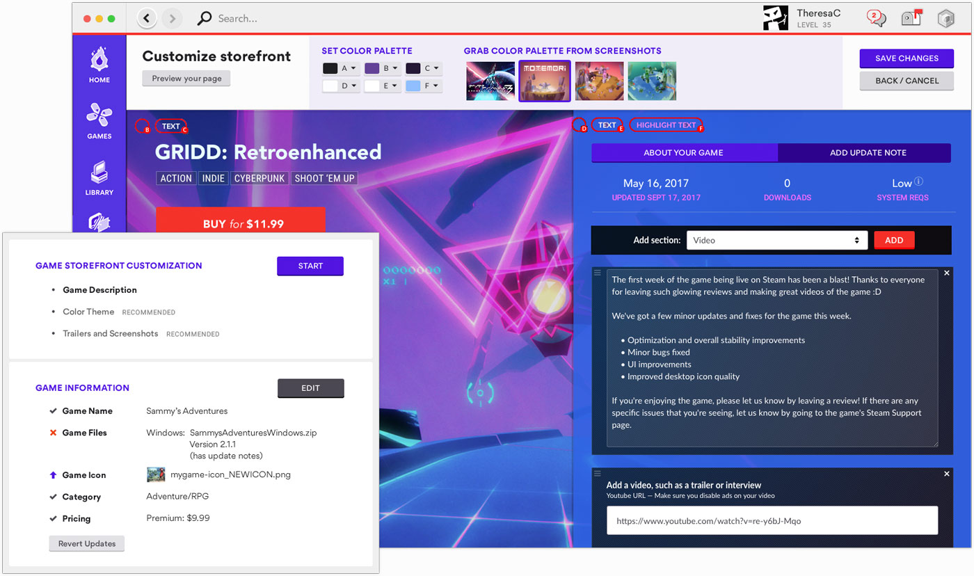
We went with a WYSIWYG style editor to eliminate that overhead. Developers could easily add descriptions and screenshots about their game directly on the page and drag it around to place order, to see in real time how it looks.
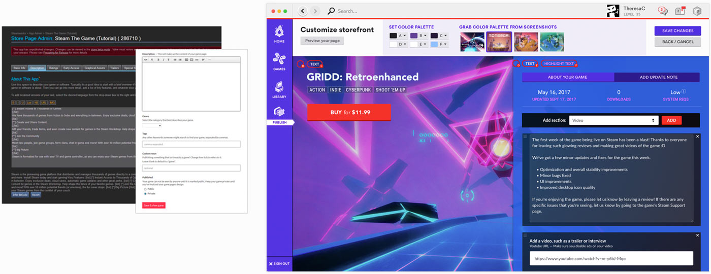 Left: Adding page content on competitors' platforms. Right: Adding page content on Kartridge.
We also wanted to make it incredibly easy for developers to choose a theme for their storefront page, without necessarily needing a design eye to create an appealing page. We implemented a color extractor that captures colors from game screenshots, sets the colors as dominant, secondary, and accent, and applies those to the page theme. From there, you can use a color picker to fine tune certain choices as well.
Recognizing that the Kartridge purple color on the left-hand navigation bar might clash with a game storefront page’s theme, we let developers choose a different color for this bar as well (the only place on the platform that the nav bar color changes). In order to accomodate for the navigation text and icons to still be readable to any color that’s chosen, we implemented a pretty nifty feature where we evaluated the saturation and luminosity of the background color, and determine if the light or dark version of the text and icons should be shown.
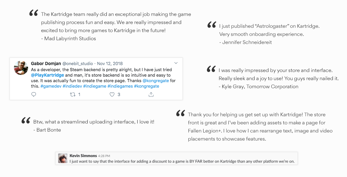
In initial feedback and public response, developers have lauded the experience on Kartridge, highlighting its easy-of-use and making it a more enjoyable and seamless process than they have had in other platforms. The onboarding flow also score a 4.5 out of 5 when we surveyed developers for usability.